


Web forms today are easy to create, and easy to get wrong. Below is a list of practical tips for designing accessible forms.
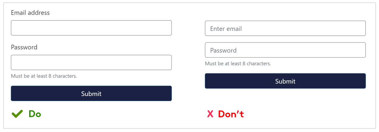
Use labels that are always visible
Don’t leave users guessing. Placeholder text may get rid of visual clutter but it disappears as soon as the user starts typing. It is also not read out by most screen readers.
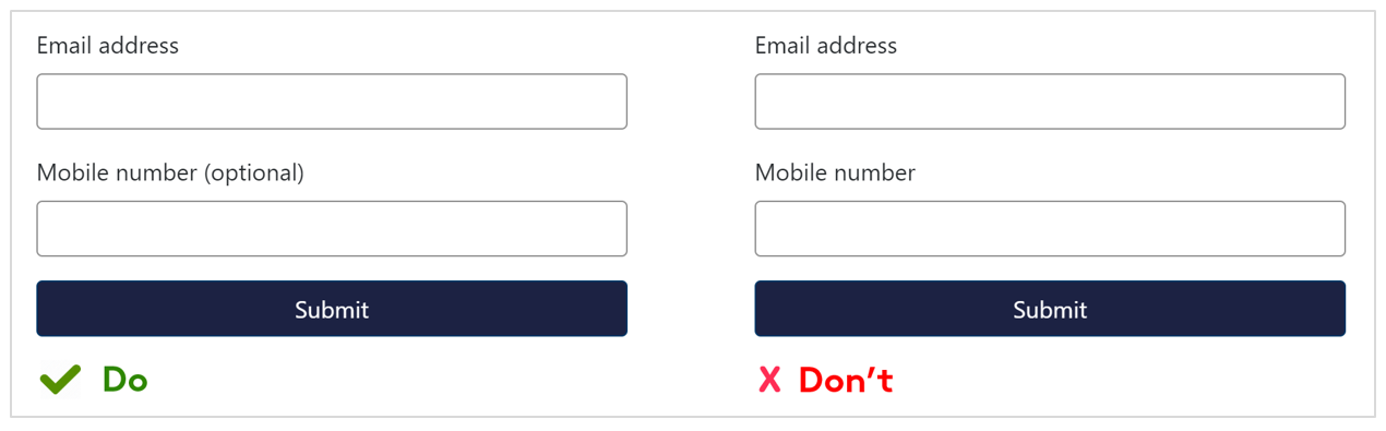
Identify required or optional fields
Identifying required or optional fields in the label helps reduce the risk of mistakes or errors being made. Use text in the label as the visual indicator as this is more visible for people who have low vision.
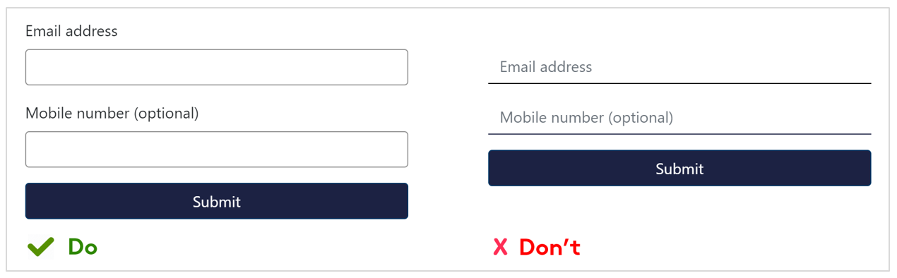
Don’t remove borders
Borders for text fields and dropdowns help users with low vision distinguish between input fields and other text. Use borders with a colour contrast ratio that is at least 3:1 against the background colour.
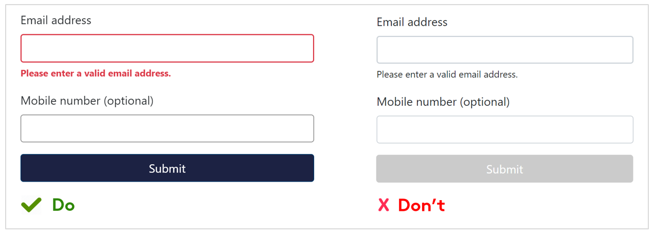
Provide descriptive error messages
Help user's complete forms by providing descriptive and clear error messages. Use a variety of techniques such as a thicker red border, red bold text, and describe the error so users with low vision can easily seem them.
Avoid disabling submit buttons for incomplete forms so users do not need to guess what still needs to be completed.
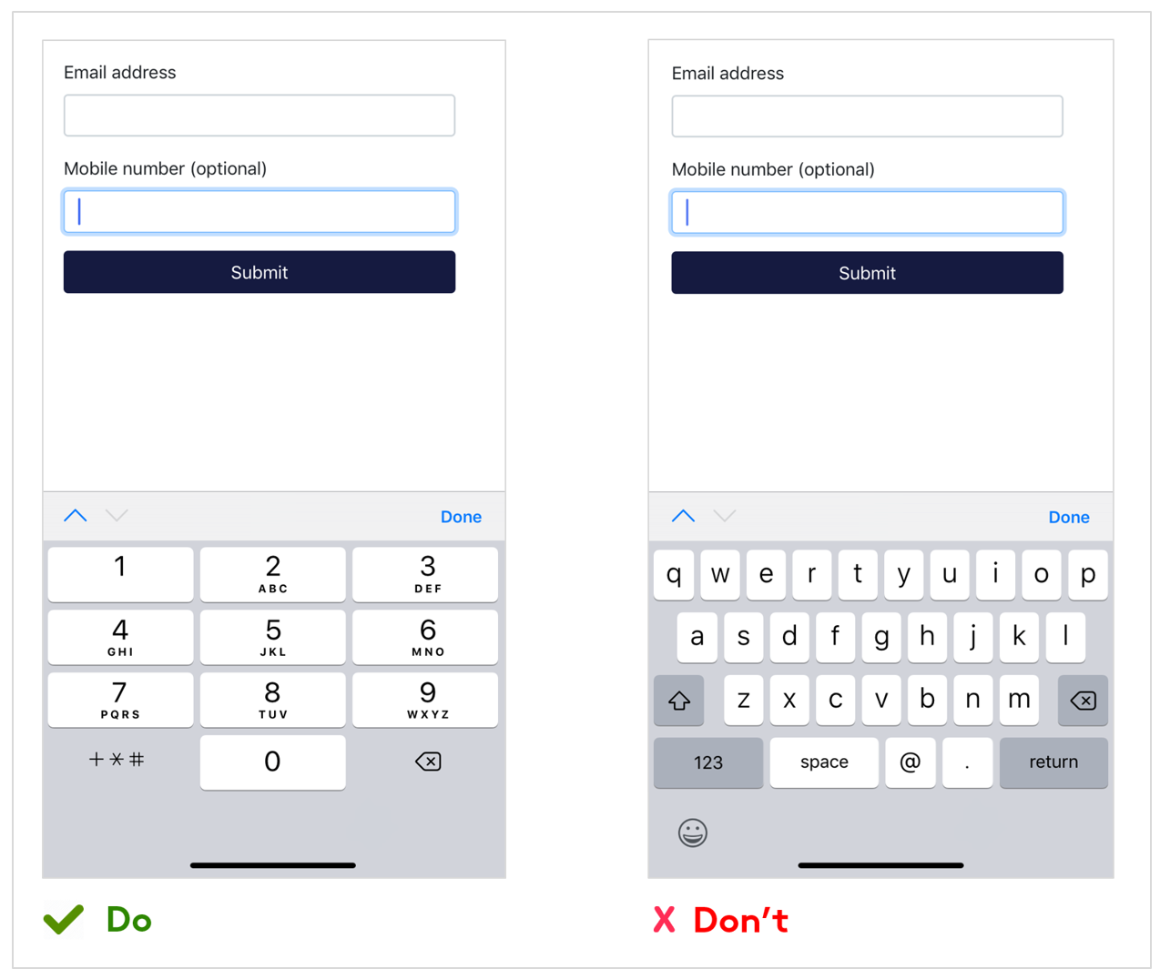
Load the right keyboard
Streamline your form using HTML input types so users do not have to switch virtual keyboards themselves. For example, display the numeric keyboard for telephone input and the email keyboard for email input.
Vision Australia’s Digital Access team have a number of free tools that can help you make sure your resources are accessible, check them out here or sign up for one of their numerous training workshops.
For further expert advice on digital accessibility, email [email protected] or call 1300 367 055.
Don’t miss out on the latest news and advice from our Digital Access team. Sign up to their newsletter here and have it delivered straight to your inbox.